NGO Photography Website | Therapy
Link: Prototype link available below
the3rdelement.life
Industry:
Mental Health/Photography
Start:
September 7, 2024
End:
October 12, 2024
How do you design a mental health platform that feels safe for teens while staying grounded in research and stakeholder expectations?
This case study unpacks how I balanced fixed stakeholder vision with user needs to create something meaningful and what I learned along the way.
And meaningful it definitely was because 'The 3rd Element' is now a Certified 501(c)(3) Organisation!

The Client
The 3rd Element is a nonprofit platform using therapeutic photography to support adolescent mental health.
My goal was to translate their mission, 'help teens express and heal using photography,' into a clear website that educates donors, engages young users (ages 10–19), and lays the groundwork for future storytelling and program sign-ups.
A more immediate goal, however, was to have a fully designed website in 2-3 weeks to pitch to investors.
The Problem
The Goal
Research & Foundations
Design Decisions
Once we had aligned on responsibilities, I shifted my focus to primary research. Regardless of it being a 'replicate website' project, I found the idea of using photography for mental health interesting so I reviewed industry trends and analysed similar sites to build a solid foundation for the design.
I strongly believed I could fight for better design practices, as the reference site was very poor usability wise. (The site 'theoneproject.co' is now shut down and can't be referenced, unfortunately)
UI wise; its boxy layout and separated text and image format felt outdated and uninspiring. The hero section specifically requested for also had an outdated gradient effect and looked poorly done.
In the end, I could not convince even with valid reasons to design a more custom, engaging site for the younger generation from scratch but there were some elements that had obvious usability issues that I was able to fight for. This is also because I wanted trust from users that would come on the site.
- Inspiration & Data-Driven Decisions:
Before starting the design, I immersed myself in understanding therapeutic photography and its potential to support adolescent mental health. As mentioned, Therapeutic photography was interesting for me since this was the first time I had heard of therapeutic photography.
However, no existing similar platform (even the reference site) directly addressed this age group, so I analyzed a range of similar sites to learn what worked and what did not i.e. BendHealth.
This exploration allowed me to read, explore and combine best practices from related fields with new ideas.
- User Engagement:
Research from Adobe highlighted that clear visuals and intuitive navigation are vital for engaging users, especially those with shorter attention spans.
I believe effective navigation is critical to any interface.
According to Nielsen Norman Group research, dropdown indicators help users quickly understand menu hierarchies.
Why is this important?
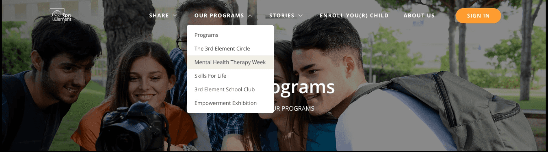
Well, originally, the project manager's plan called for a menu without these cues. So I recommended a simpler approach, adding dropdown icons for clarity. I explained how these visual cues help users quickly understand the site structure, and after some in-depth discussions, I was able to convince him to include them.
The project manager also envisioned an 'About Us Menu' similar to Bill Gate Foundation's website. I explained this was not feasible because one menu item can not be different from others for usability sake. Also the Bill Gates' About Us page had multiple pages; the 3rd Element site did not.
The developer also confirmed that the complex design wasn’t feasible from a development point of view, so we struck a balance: a streamlined menu that preserved both usability and the intended design aesthetic.
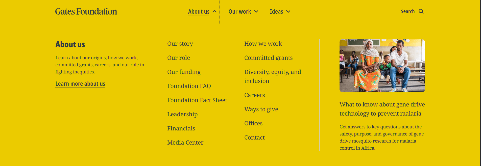
Gate's Foundation's About Us Menu works because it is very content heavy and has different pages under.
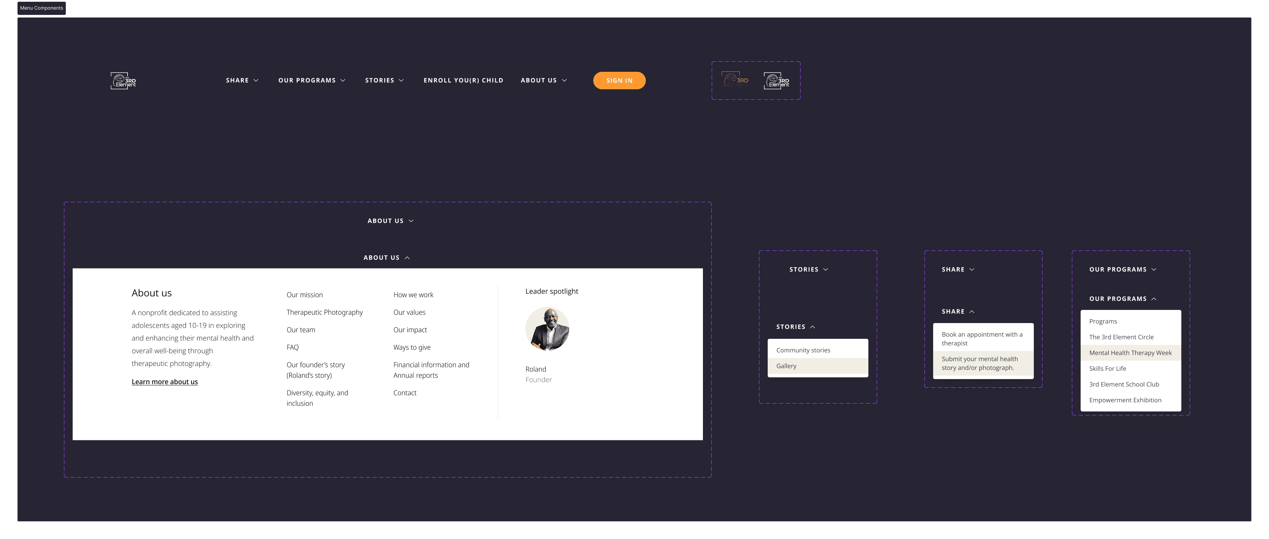
The 3rd Element About Us is only one page with short copy sections. This means these links point to different sections on one page. This has, fortunately, now been simplified.
The dropdown cues I pushed for and added to the website.
- Mental Health Awareness:
Understanding the audience was crucial. Globally, it is estimated that one in seven (14%) of 10–19-year-olds experience mental health conditions (Global Health Data Exchange), yet these remain largely unrecognized and untreated.
This information drove me to prioritise clarity and sensitivity in every element of the interface to support the well-being of its users. The site also had to feel safe, not clinical.
So I went on to create a design that I felt embodied these.
But this was before I found out it was a replicated website needed.
My initial hero section before this discovery was designed as a visual blueprint for the entire site; a polished, colour-rich representation to guide the aesthetics across subsequent pages. At that early stage, content was still in development, so I deliberately opted for a mid/high fidelity design that felt tangible and accessible, rather than a traditional low-fidelity wireframe that might have been too abstract.
However, I found out after submitting the mid-fidelity design for review that the project manager wanted a replication of the theoneproject.co website, which prompted a complete redesign. And no amount of convincing could work here, even with data gotten from secondary research. So, I replicated the website but infused modern touches wherever possible to enhance the overall user experience.
I want you to imagine you’re between the ages of 10 and 19. Which design would you rather scroll through? I am genuinely curious because even as a designer, I may have some biases.

The left is the replicated design, and the right is my initial design.
Although, given more time and creative freedom, I would have loved to find out directly from the target users using A/B testing, which prototyped design they found engaging.
Also, from both a design and business perspective, I was intentionally pushing for something more modern and creatively engaging (with interesting animations and interactions), especially given the target age group.
Also, you’ll notice the minimal use of copy in my initial design. That was a deliberate decision. My research indicated that this demographic is less likely to read large blocks of text on a website. So, I focused on presenting only the most essential information upfront, with plans to place additional details, still in a more concise form, on supporting pages like the FAQ.
-Easily Digestible Information
Eventually, the copy was provided. The text was quite heavy and was provided bit by bit, so I could not really tell how much space was needed for the text element. So to ensure that essential information wasn’t lost in a sea of words, I restructured the content into digestible sections.
By using clear headings, bullet points, and strategically placed visuals, I was able to communicate the message effectively without overwhelming the user.
Key Takeaways
Structured Discovery prevents misalignment: early calls + targeted questions saved hours later.
Collaboration: Working closely with both the developer and the project manager was crucial in creating a solution that both stakeholders and users are happy with.
This project tested everything: speed, communication, emotional intelligence, and flexibility. There were moments I considered stepping back.
But in the end, it’s one of the most meaningful things I’ve worked on. I helped a passionate team take their idea and turn it into a movement-in-progress.
