Dr. Mind - AI Insights for Mental Health
Link: Prototype link available below
https://bit.ly/3KNAxKM
Industry:
Mental Health & AI
Start:
December 11, 2025
End:
December 16, 2025
Dr. Mind is a personal product case study exploring how AI can surface mental-health insights without pressure, judgment, or emotional overload.
Instead of optimizing for motivation or productivity, this project focuses on a quieter moment: when users don’t feel like journaling, but still want reassurance and understanding from their data.
The result is a calm, interpretive AI dashboard that reflects journaling patterns without scores, streaks, or prescriptive advice.

The Client
Personal project.
The Problem
Most mental-health apps assume users feel motivated, reflective, and ready to engage.
In reality, many users open these apps during:
low-energy days
emotionally sensitive moments
quiet curiosity, not readiness to act
At that point:
scores feel judgmental
streaks feel punishing
advice feels overwhelming
This creates avoidance; the exact opposite of what mental-health tools should do.
The Goal
Design an AI-driven insight experience that:
delivers meaning without requiring effort
avoids judgment, diagnosis, or performance framing
builds trust in AI interpretation over time
supports return visits on difficult days
The core question guiding every decision:
How can AI reflect patterns without telling users what to do or how to feel?
Research & Foundations
I was studying how these products behave in low-energy, high-sensitivity moments, because that’s where retention is usually lost.
Apps reviewed:
• Day One — long-form journaling with attachment-heavy composers
• Stoic — mood tracking centered on streaks, trends, and progress
• Reflectly — guided prompts with motivational framing
• Mindsera — AI-generated summaries and interpretations
• Apple Journal — system-level defaults and restrained emotional framing
What consistently hurt retention:
Across most products, I saw patterns that optimize engagement metrics, but risk long-term trust:
• Too many visible actions upfront, before intent is clear
→ increases cognitive load and early drop-off
• Streaks, scores, or progress indicators
→ create guilt after missed days and avoidance after lapses
• Confident or interpretive AI language
→ increases skepticism and disengagement when users feel emotionally fragile
These patterns work when users feel motivated.
They fail when users feel tired, unsure, or emotionally sensitive - - the exact moments when retention matters most.
The Apple Journal distinction (and why it mattered):
Apple Journal includes streaks, but crucially:
• they are de-emphasized
• not emotionally framed
• not used as motivators
• not surfaced as success or failure signals
They exist as background metadata, not pressure mechanisms.
From a retention perspective, this showed me something important:
it’s not the presence of metrics that causes harm — it’s their emotional framing and visual priority.
What I intentionally did not reuse:
Based on this analysis, I made deliberate exclusions:
• ❌ Streaks or continuity cues as primary motivators
• ❌ Emotional scores, averages, or percentages
• ❌ “Progress” or “improvement” framing
• ❌ AI insights presented as conclusions or advice
While these patterns can increase short-term interaction, they often reduce return visits after emotionally heavy weeks.
Design implication:
Dr. Mind is designed for the moment before motivation - - when curiosity exists, but energy doesn’t.
By removing pressure structurally (not cosmetically), the design aims to:
• reduce avoidance after missed days
• increase trust in AI interpretation
• encourage re-entry without guilt
The retention bet is simple:
users return more often to systems that don’t punish absence or emotional fluctuation.
Apple Journal
Stoic Journal
Design Decisions
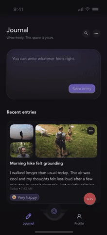
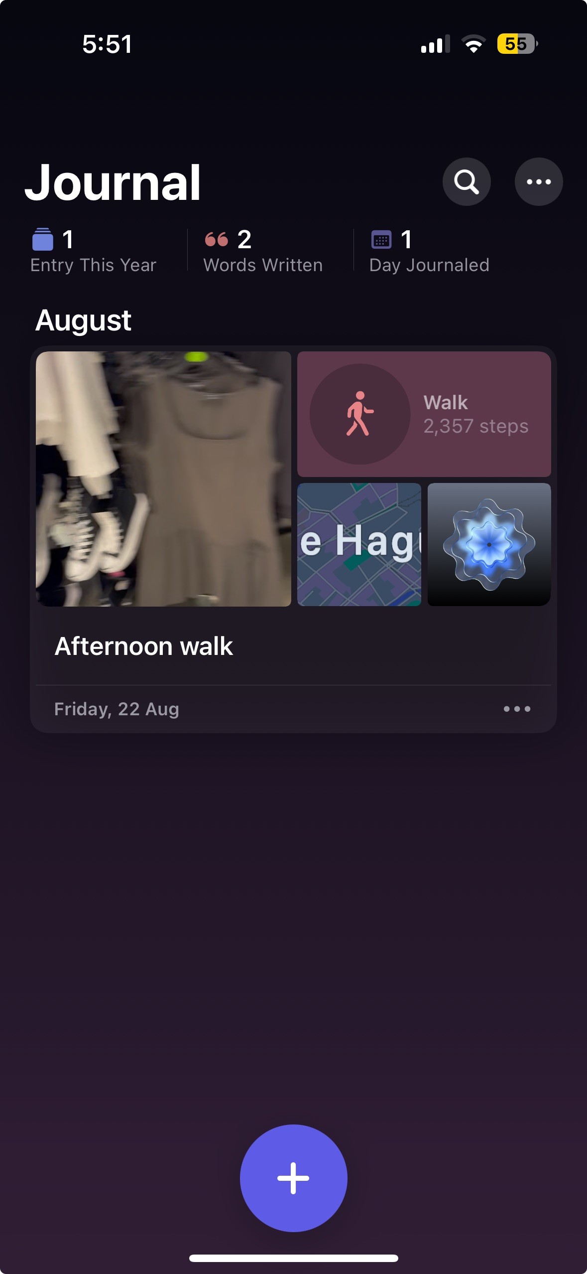
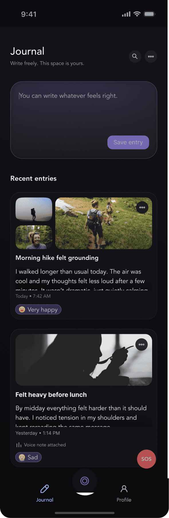
1. Journal as a neutral home (not a task)
Most mental-health apps open with prompts, tools, or expectations.
I intentionally designed the journal home as a quiet, empty surface.
Advanced inputs (voice, media, mood) are hidden by default and only appear after the user shows intent to write.
Trade-off: slower feature discovery
Why it matters: Reduces cognitive load and performance pressure, increasing the likelihood of return on low-energy days.
——-
2. No streaks, scores, or progress framing
I deliberately avoided streaks, averages, and “improvement” language.
Emotional data is subjective, contextual, and non-linear.
Quantifying it creates false certainty and invites self-judgment, especially after missed days.
Design stance: Emotional safety over engagement optics
Outcome: Long-term trust and retention over short-term interaction spikes
——-
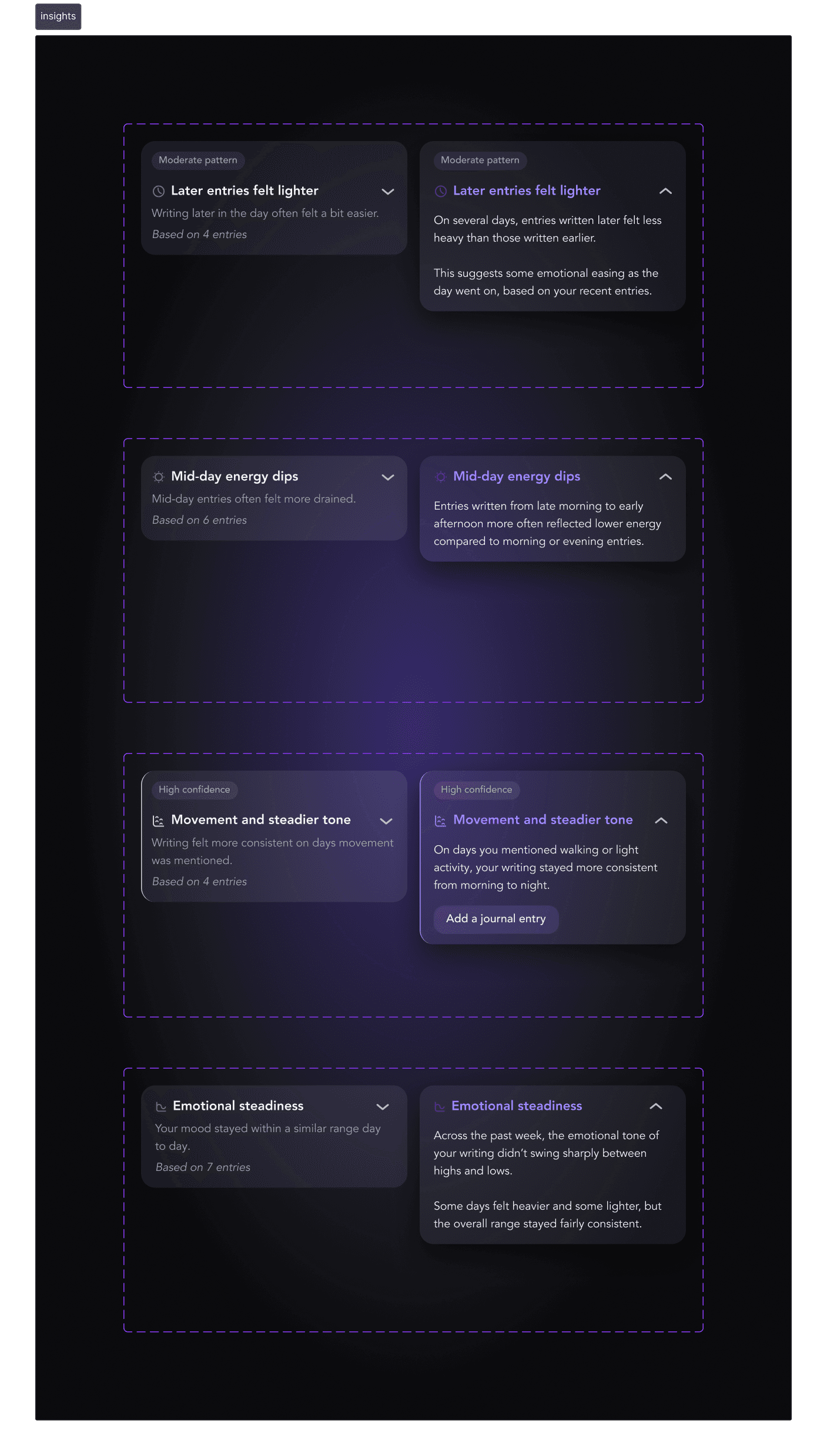
3. Insights as observations, not advice
All insights follow a strict rule:
They describe what was noticed, never what to do.
No recommendations by default
Progressive disclosure for optional depth
Explicit scope (“Based only on the past 7 days”)
This reduces over-interpretation and positions the AI as a reflective system, not an authority.
——-
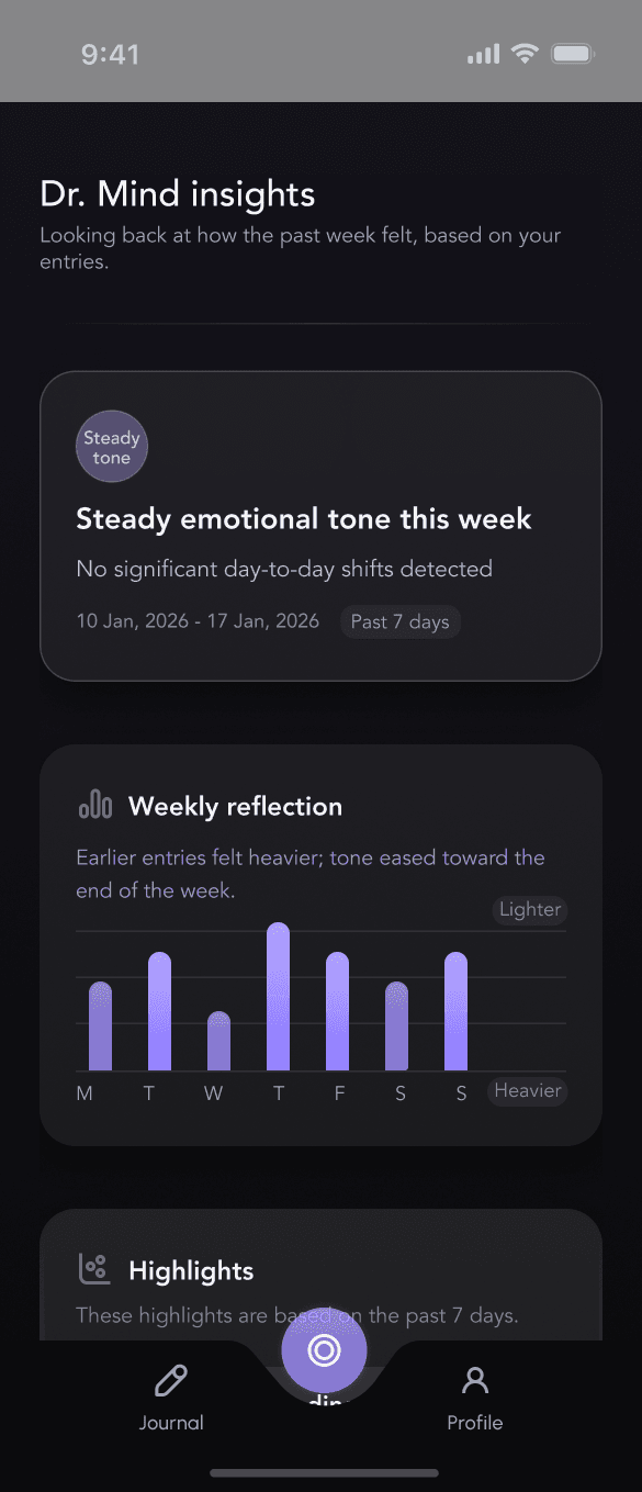
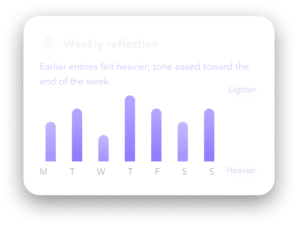
4. One chart, one meaning
The dashboard includes a single weekly bar chart.
No numbers
No axes
No interaction
Bars represent relative emotional tone only (lighter ↔ heavier)
The chart exists to support the written insight, not replace it.
Users understand it in seconds and move on, avoiding rumination or over-analysis.
———
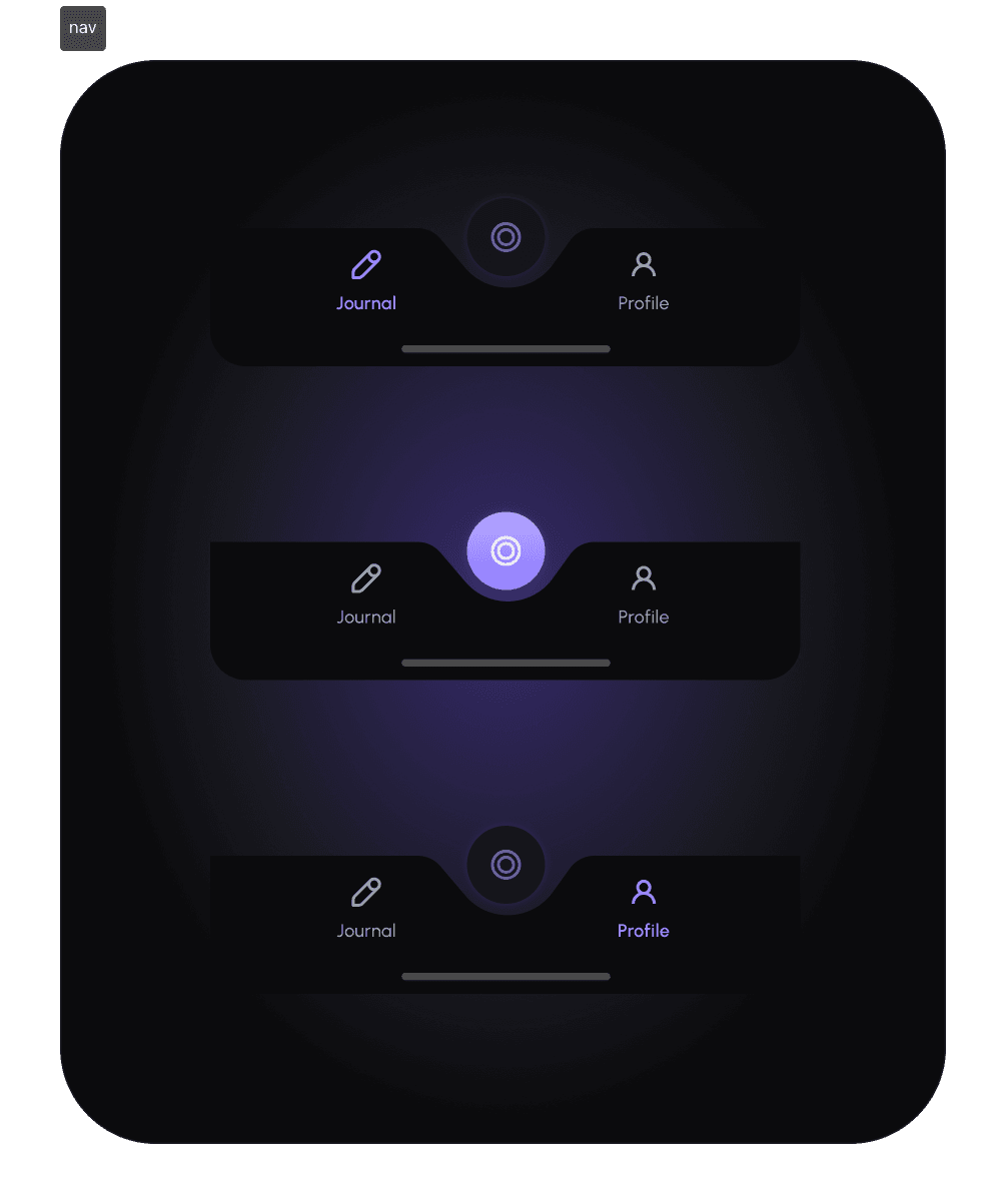
5. Navigation that signals importance without urgency
Dr. Mind is visually distinct in the navigation, but never alarming.
Centered, elevated icon
No red, no pulsing, no alert cues
This signals relevance without demanding attention.
Result: Users explore insights out of curiosity, not pressure.
Key Takeaways
This project changed how I think about designing AI for mental health.
I started with one question:
What should an interface do on days when users don’t have the energy to engage?
The answer wasn’t softer copy; it was structural restraint.
I learned that emotional safety is designed through:
• what the product doesn’t ask for
• what it refuses to measure
• and what it waits to reveal
AI felt more trustworthy when it showed limits.
Time-bound insights, explicit scope, and the absence of scores made the system feel interpretable, not authoritative.
I also learned that retention in mental-health products isn’t driven by streaks or frequency.
It’s driven by removing penalties for absence.
Designing for return after missed days mattered more than designing for daily use.
Finally, I learned that fewer insights create more trust.
One clear pattern users understand beats five they feel unsure about.
If I extended this work, I’d explore adaptive insight cadence and user-controlled sensitivity, building on the same principle that guided the project:
Design should meet users where they are, not where the product wants them to be.